Preware Design
Rick's Intro to why this is Important
this morning (26 July 2009) after my morning OA meeting, at coffee I ran a set of paper prototypes of a gui appstore front end for the webos-internals ipkg feed past a group of women aged 45 to 82 who had not previously used a Pre.
Each of them had the chance to go into launcher, bring up an app, run it, go into the app store, look around, etc before starting the prototyping session.
First, as a group they all hated the palm appstore. They disliked the horizontal scrollers at the top, they disliked the scrolling aspect of the entire page. They wanted much more clear indications that a scroll was available, but they thought that a thinner leaner first page would be much better.
After 30 minutes of the group tearing up 4x6 cards and scribbling new ones, we ended up with the following decisions which I pass along.
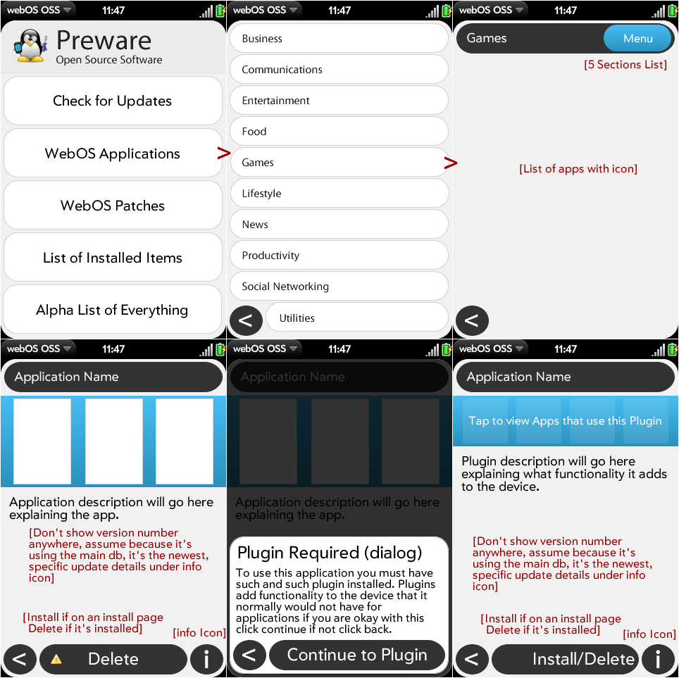
- the first scene should have 5 selections
- Upgrade your installed apps
- Patches for existing apps
- WebOS applications
- Delete things you have installed
- Alpha list of everything
each of those opens a new scene. along the bottom of the scene is a fixed button bar with on the left, an INSTALL button, in the center a BACK button and on the right a DELETE button
that button bar is ALWAYS there except on scene 1. They know and understand the back gesture, but they liked the idea of a back button even so, and since there was a space, why not?
the install and delete buttons dim out or come live as appropriate.
They were divided on the subject of keeing a banner for the app store at the top of the screen, some liked the idea of a HOME button. Some did not and wanted the space for the lists and said "banner only on the home page.
Each subsidiary screen brings up a list of apps. that list scrolls in the space ABOVE the button bar.
Tapping an ap brings up the long description of the app and enables the install or delete button as is appropriate.
The graphical design should be very VERY clean and not busy. It was a major complaint about the Palm app store that it was too busy.
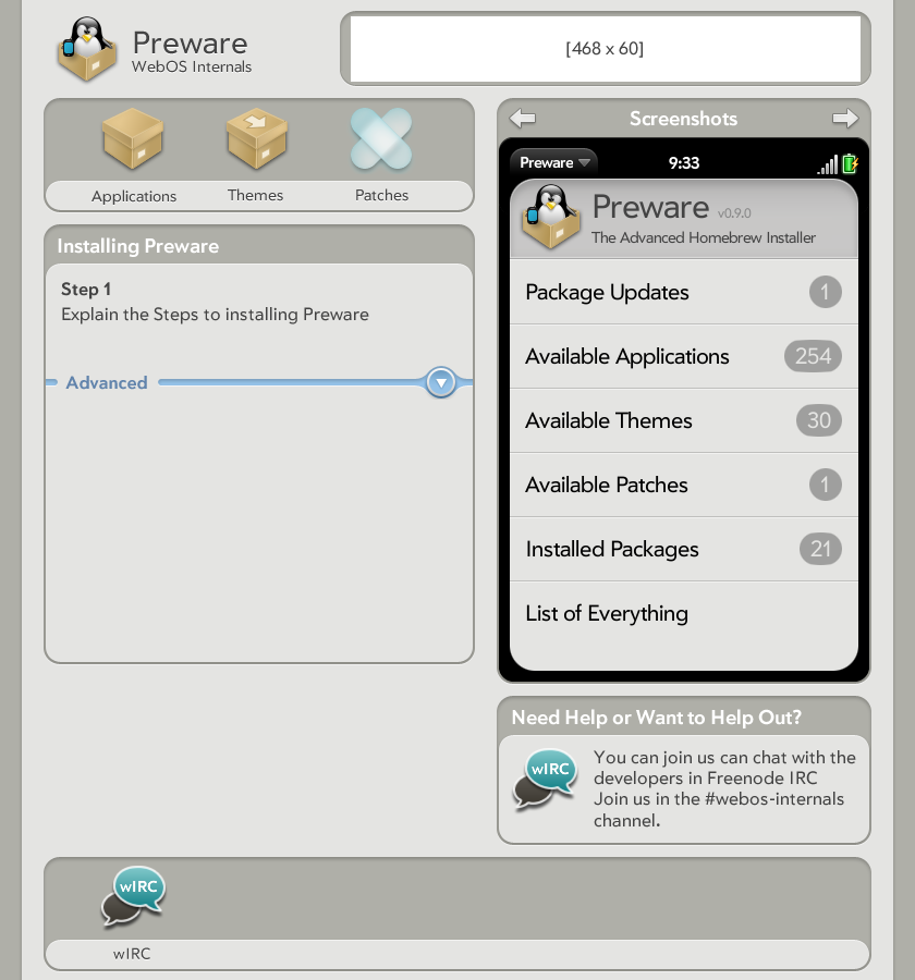
Templarian's mockup for the PreWare home page is a really good basis to work from, and it would be good if the gui app resembled the submission and management page. It will change depending on comments here.
I thought this would give us a starting place
- Rick
Suggestions
Naming (Preware isn't the best future proof name so discuss)
hmm
Application
(Images will be updated below as suggestions come in, wiki forces cache so CTRL+SHIFT+R in modern browsers)

