Difference between revisions of "Tutorials webOS Porting Older App/example"
Rboatright (talk | contribs) (15) |
Rboatright (talk | contribs) (16) |
||
| Line 78: | Line 78: | ||
[[Image: Pegged6.png|thumb|left]] Clearly, our calculations about width were off. Ooops. Let's see, | [[Image: Pegged6.png|thumb|left]] Clearly, our calculations about width were off. Ooops. Let's see, | ||
| − | 320 / 7 = 45.71 and our images are 45 with a 2 px border, which adds up to 329. Ooops. How about we just make those nasty borders go away? | + | 320 / 7 = 45.71 and our images are 45 with a 2 px border, which adds up to 329. Ooops. How about we just make those nasty borders go away? And while we're at it, oh yea, forgot to copy the css into the app's css file. |
[[Image: Pegged7.png|thumb|left]] and with that, we have a working pegged program on the Pre. Are we done? Well, we're done for TODAY. We're tired. But tommorow holds the tweaking challenges. Where did those horizontal bars come from? Why is there so much blank space above the game? How do I make my transparent PNG's for the corners actually transparent? Can I make an empty circle cell look nicer and not all Jaggey? But that for another day. We have successfully ported an alpha of our app to the Pre. Congratulations. | [[Image: Pegged7.png|thumb|left]] and with that, we have a working pegged program on the Pre. Are we done? Well, we're done for TODAY. We're tired. But tommorow holds the tweaking challenges. Where did those horizontal bars come from? Why is there so much blank space above the game? How do I make my transparent PNG's for the corners actually transparent? Can I make an empty circle cell look nicer and not all Jaggey? But that for another day. We have successfully ported an alpha of our app to the Pre. Congratulations. | ||
Let's make sure we push a copy of the ipk up too. [http://www.vocshop.com/preport/com.boatrights.pegged_1.0.0_all.ipk] | Let's make sure we push a copy of the ipk up too. [http://www.vocshop.com/preport/com.boatrights.pegged_1.0.0_all.ipk] | ||
Revision as of 01:09, 11 August 2009
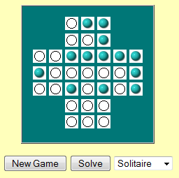
In this example we will be porting an older javascript application to the Pre. You can see the original, and its source code at The Javascript Source. Our starting point will be their exact html and graphics. Play the unmodified game at [1]
This is the classic game "Pegged" or "Solitaire" It involves jumping pegs and attempting to end up with just one left.
Our first concern with this program will be layout, graphics and size. As written the board is 188 px wide. Within the blue square the cross is 156 px wide. That means that the tap targets for the cross are only about 22px square. The images themselves are 19px. That's far smaller than Palm's suggested size of 40px.
If we eliminate the blue border, and resize the cross to fill the pre screen, seven dots horizontally will use 320/7 = 53 dots per square. More than big enough. if we use 45 dots per square, that's 310 px and gives us space for borders.
So, the plan is, to resize the individual dot images from 19px each to 45px each. then, we can have a 1px border between each dot image, totaling to 316 px, allowing a 2px border on each side.
You can use any graphic resizing program you like. On windows irfan view makes this very simple. Here is the before for a blue peg: ![]() and the resized 45px peg
and the resized 45px peg ![]() . While we're at it, we convert from gif to png.
. While we're at it, we convert from gif to png.
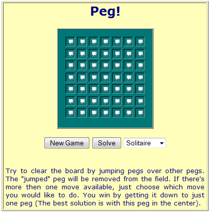
Let's take a quick look and see what that does to our board.
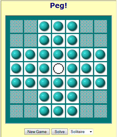
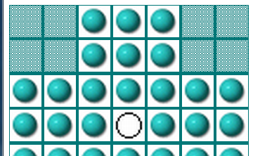
oops. That didn't work, our html is still calling for gif's and the size didn't change, something in the html is specifying 19px images. Time to go hunting. A global find and replace for .gif with .png solves the first problem. A search and replace for 19 with 45 solves the second and we get a new board:
Something went wrong with the transparent images that made the corners, we'll have to fix that, and the blank circle is a little ugly, we need to fix that too, but we now have a larger grid.
We know we're going to have to start looking at the html soon anyway. The game is playing in a big pink box that has to go away, the borders are the wrong size, and it seems certain that there are other issues. [2]
So, let's take a look at the code of the page. The first thing to note is, it's all munged together in one giant html page. We know we're going to have to seperate out the JS from the HTML.
The second thing we note is that the program uses document.write. That's got to go away too.
First, we take everything from line 4 to line 406, and move it out into a new file, pegged.js and remove the script tags and the enclosing comments from the file. Change the HTML comments at the top to Javascript comments. (Remember the house style says use // comments not /**/ comments. A quick run through jsbeautifier gives us the first pass js file at [3]
Then, we strip that out of the html file, and make a link to our js by putting in
<script src="pegged.js" type="text/javascript" />
Looking in the body of the html, we note that the body is ENTIRELY written by a javascript document.write function. The reason becomes apparent 13 lines down from the beginning of the body.
if (navigator.appName != "Microsoft Internet Explorer") {
document.write(...
The page is attempting an early version of browser sniffing to detect which sort of DOM it needs to build. Since we're running on ONE browser, and it isn't an ancient version of Microsoft Internet Explorer, we don't need ANY of that.
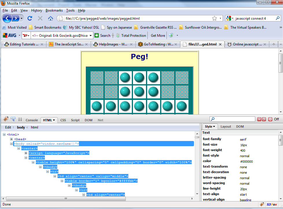
What we want is the html that is the RESULT of running that script. We could go through and figure that out line by line, but why do that when we have a javascript interpretor right there in our browser. So, open the page again in Firefox, and open Firebug. Pull up the html, and expand every + sign, and copy the rendered html out and paste it into our version 3 html page.
at this point then, we have a start on version 3, with a separate html file with no JS in it, a call to an outside JS file, and larger images. Before we finish this step, we run the html file through HTML tidy at infohound's on line tidy page and let it clean up the markup and convert to xhtml, since that's the pre's doctype. Now when we bring the page up, it renders a looks just like our version 2, but it doesn't play.
Let's call that Version 3. [4]
Why isn't it playing? If we use firebug, and set a breakpoint on the onclick of any cell, it calls move() which is a function in our pegged.js. We can step through and follow all the logic, but nothing updates... Why?
document.images["img" + (basenum + destnum1)].src = empty.src;
Looking through the pegged.js we find a lot of code that reads like that, calling into the DOM to replace an image source. That's so last century. They're making all kinds of assumptions about what the DOM position of the image is. Oooops. The way we do things TODAY is with element ID's. But going back to the HTML, all our image elements say things like:
<img height="45" border="0" width="45" name="img14" src="peg.png" alt="Peg" />
So, first, we do a global search and replace for 'name="' with 'id="'. (Fortunately for us, all the names were unique. -- this time -- . )
Now, we go back to the js file and do some more search and replace. We're going to replace document.images[ with $( and ].src with ).src. Of course, at this point, since we're using the $ function,we have to add the prototype library into our html file... we didn't need it up till now, but we're going to be using it on the Pre, so we need it here.
<script src="prototype.js" type="text/javascript">
And it runs! Yea! let's call that v4 [5] and make another copy (of course, a SMART person would be pushing to a version control system for each of these steps, wouldn't they?)
At this point, we're a little tired of messing with the JS, and we know we have layout issues, let's look at those. Back in the HTML file, there's a BIG table enclosing the game table. Lets lose it.
Then, because we're only allowing 2px between the images, let's take the cellpadding from 15 down to one and the border to zero. a quick check says that those lines between the cells still look awfully wide, and a screen ruler says we're 341px wide on a 320px screen. What ever could have gone wrong? Back to Firebug!. If you've played this game before you can probably already guess what the problem is, some clever person put SPACES between the images to make borders.
<img height="45" border="0" width="45" id="img0" src="blank.png" alt="Peg" /> <img height
so, another round of search and replace to get rid of the spaces, and replace all those border=0 with border=1 and by GOLLY we got game! .
At that point, staring at the html, it occurs that for some weird 1990's reason, every image is wrapped in an <a> tag with an onclick instead of just putting the onclick directly on the image. Well, a bunch more search and replace later, and THAT mess is dealt with.
Now, we have a version of the program that runs smoothly 320px wide or less, and is predictable (except for some reason we've broken the auto-solver... but for now, who cares? Let's comment that out, and try moving this baby over to the Pre!
We use either the komodo or eclipse editor to
- create a new app
- add a scene called 'game'
- add the pegged.js to the sources.json
- copy the body of our pegged.html into game-scene.html
- tell the stage-assistant to push game-scene
- copy our images into the images folder of the app
- save everything
- package to an ipk and push to the emulator!
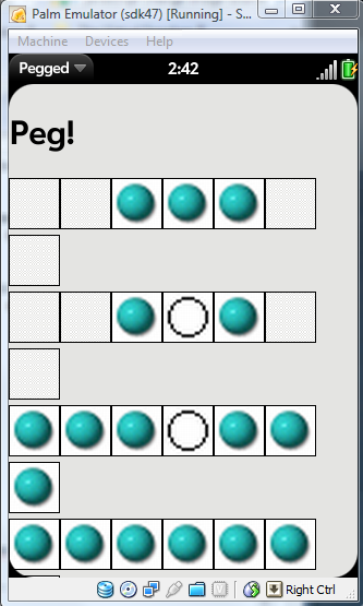
Yippee..... oooops.... errrr. what did I do wrong?
Clearly, our calculations about width were off. Ooops. Let's see,
320 / 7 = 45.71 and our images are 45 with a 2 px border, which adds up to 329. Ooops. How about we just make those nasty borders go away? And while we're at it, oh yea, forgot to copy the css into the app's css file.
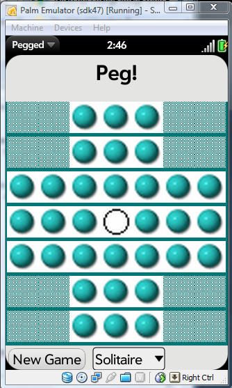
and with that, we have a working pegged program on the Pre. Are we done? Well, we're done for TODAY. We're tired. But tommorow holds the tweaking challenges. Where did those horizontal bars come from? Why is there so much blank space above the game? How do I make my transparent PNG's for the corners actually transparent? Can I make an empty circle cell look nicer and not all Jaggey? But that for another day. We have successfully ported an alpha of our app to the Pre. Congratulations.
Let's make sure we push a copy of the ipk up too. [6]
